By RAFAŁ WAŚKO (Predictive Solutions)
A WATERFALL GRAPH, OTHERWISE KNOWN AS A CASCADE CHART, MAY MEAN VERY LITTLE TO THOSE OF US FROM OUTSIDE THE FINANCIAL SERVICES INDUSTRY.
In this post I will explain what a waterfall graph is and what type of data can be presented with it.
There are many popular charts, e.g., bar, pie or line charts, the interpretation of which is fairly straightforward. We frequently see such visualizations in mainstream media and in industry news. Being accustomed to these types of charts, journalists often look no further for alternative visualizations which might present their data better. I dedicate this post to those who are interested in expanding the portfolio of charts they use.
A waterfall graph is typically used to understand the contribution of particular elements to the overall result. It presents which part of the whole can be attributed to particular categories of a variable. A waterfall graph is a bar chart in which the location of the bars in relation to the y-axis depends on the location of the preceding bar, and where each subsequent bar begins from the end value of the previous bar. The cumulative value is also presented in the form of a Total bar. Bars can present the numbers for the categories of a variable or totals for a quantitative variable.
A waterfall graph can be used to present, among other things, data concerning warehouse stocks, revenue, financial balance sheets and other data in which increases and decreases may occur in individual values. Positive and negative values are marked with different colors.
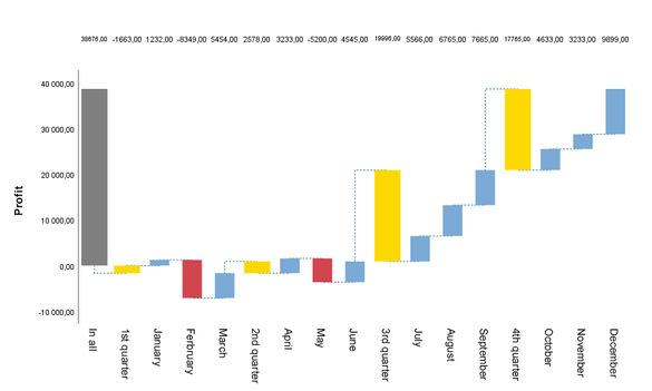
The waterfall graph below presents a financial balance sheet of an enterprise. As we can see, the first bar illustrates the year-end profit , and the following bars represent the profit (blue bars) or loss (red bars) in particular months, togther with quarterly results (yellow bars).

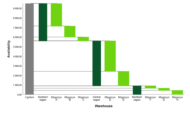
Another example for the use of a waterfall graph is a warehouse inventory audit. Information on how many items are in stock ensures that sufficient supply is provided to stores in particular regions. As one can see in the chart below, the level of warehouse supply is quite diverse across regions. The northern region shows the lowest level of items in stock which may prompt actions such as redirecting some items to this region thereby preventing out-of-stock situations in that region’s stores.

A waterfall graph is an interesting alternative to traditional bar or line charts. It serves to present in a transparent manner the contribution of particular categories to the overall result, illustrate increases and decreases, as well as present data in time series.
The waterfall graph is one of 50+ custom built procedures included with PS IMAGO PRO .
Contact us to find out more about these and all other great features of PS IMAGO PRO!

Kommentar schreiben