
English

English · 29.04.2020
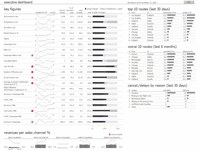
In these turbulent times, data analysis is certainly not the most important item on the agenda for most organizations, unless it is used to combat the virus. Paying salaries and keeping the company financially stable are top priorities.
But what analyses are needed to combat the virus and how are they prepared or presented?
English · 22.04.2020
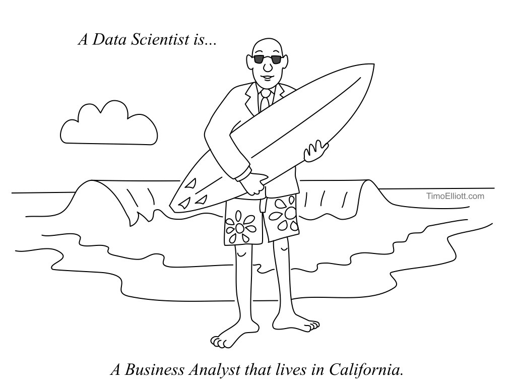
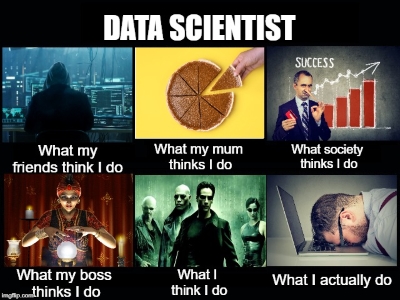
Here's take 2 of "There's a funny side too Data Science, with many thanks to Tim Elliot for his awesome cartoons.
English · 14.04.2020
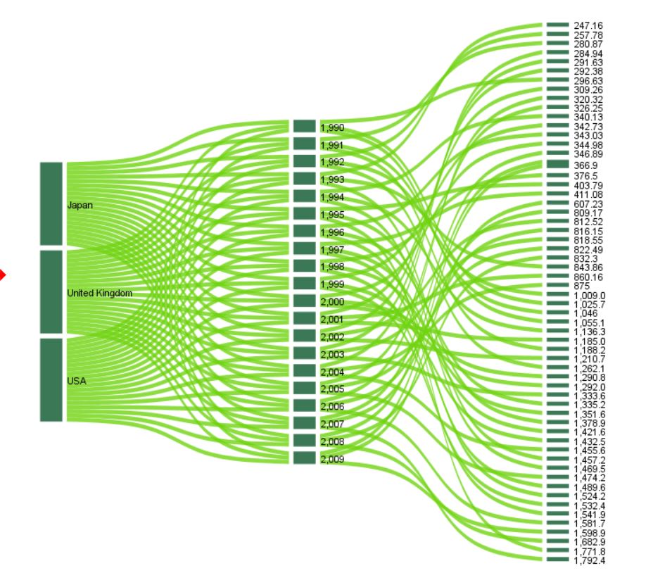
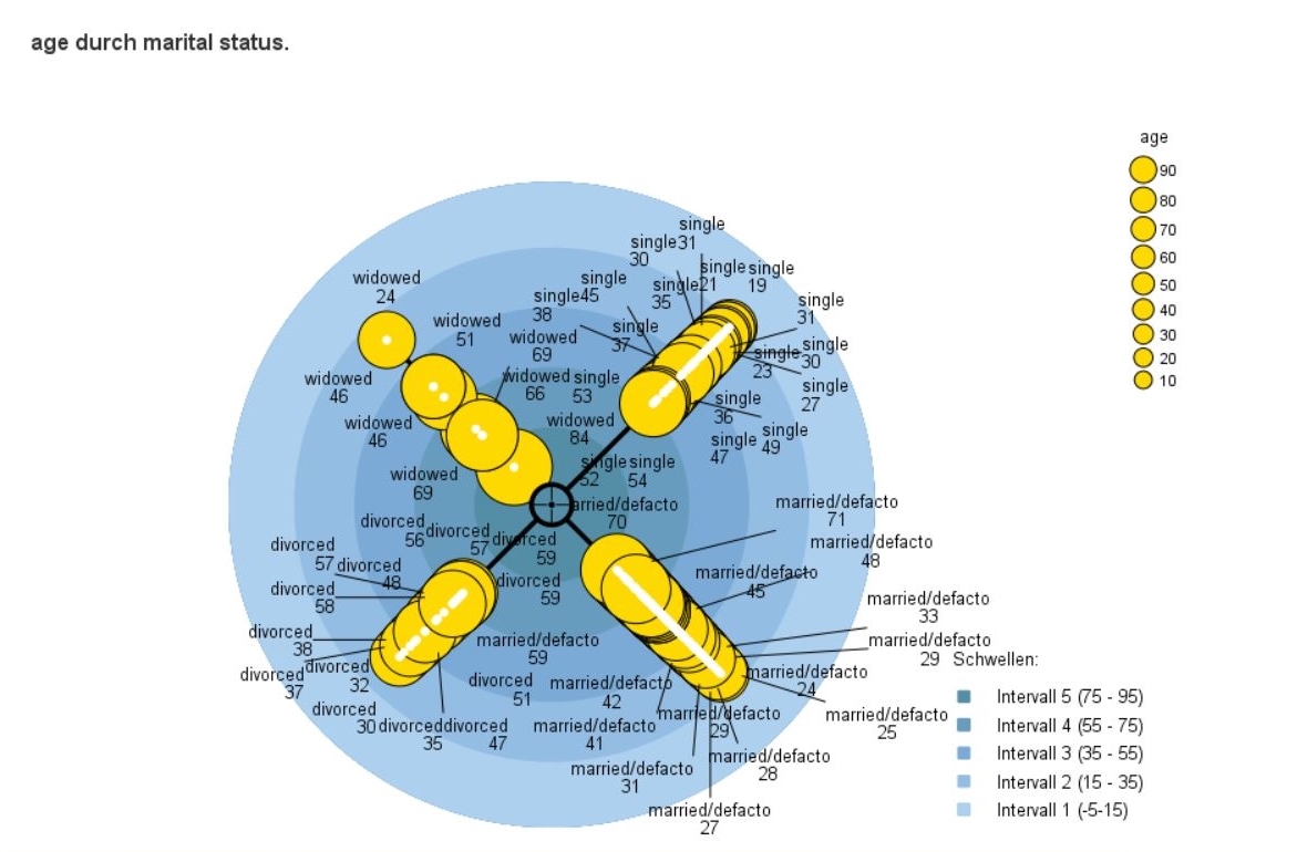
When analysing data on migration, transport, international trade, or traffic on a website, you are often faced with the problem of visualising the flow between the analysed units.
English · 14.04.2020
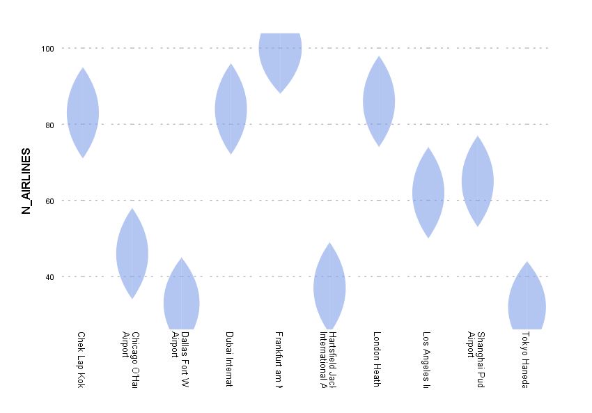
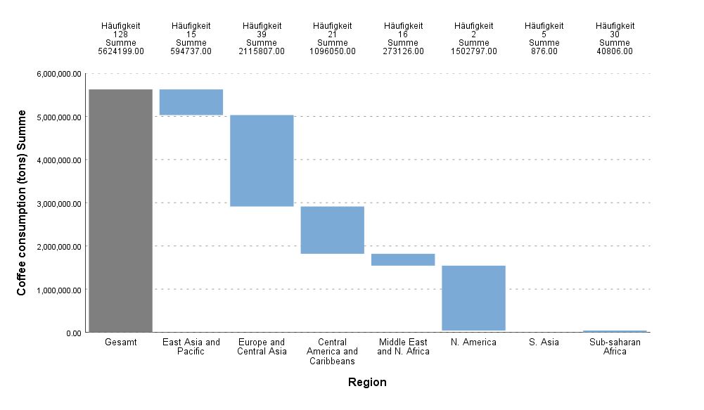
The dartboard visualization is another useful medium for presenting the results of analyses on a dashboard.

English · 22.11.2019
Are you a Data Analyst/Scientist? We would love to know: What’s your best data joke? After all, “Statistics may be dull, but it has its moments.”
Kontakt
2x4 Solutions GmbH
Eichenring 23a 84562 Mettenheim Deutschland
Telefon: +49 8631 3516525 Email: [email protected]
Contact
2x4 Solutions GmbH Eichenring 23a 84562 Mettenheim Germany
Phone: +49 8631 3516525 Email: [email protected]
Hinweis
Unser Angebot richtet sich ausschließlich an gewerbliche Kunden. Alle angegebenen Preise zzgl. ges USt. Für Firmenkunden aus der EU (nicht Deutschland) wird das umgekehrte Mehrwertsteuerverfahren angewendet, wenn uns eine gültige UST-ID vorliegt.
Notice
Our offer is for business users only. All shown prices are net values and VAT will be added. If we know the customers VAT ID, we will use reverse VAT for EU-companies outside Germany.
