Written by Janusz Wachniki (Predictive Solutions)
THE DASHBOARD IS A TYPE OF PANEL BOARD, A CONTROL PANEL, OR INSTRUMENT BOARD.
FROM A BOOK TO A REPORT
Pushkin is believed to have said that ‘reading is the best way to learn’ and Diderot, that ‘people stop thinking when they cease to read’. The famous names and the form of maxims are a diversion from the fact that these are truisms. Who was not forced to read as a child? Worse still, some say they like it.
Instead of dealing with clichés, let's think for a moment about what we read. And I don't mean your favourite genre. It's a matter of taste. I will focus on the medium for the information. The traditional book is the rustle and smell of paper, the cover and pictures. Sometimes the edition itself is an added value. On the other hand, a printed book has a mass and size, is not always easy to come by whether on the road or because it went out of print. The other issue is, is this type of medium environmentally friendly?
If the book is not viewed as a collector's item but is valued mostly for its content, today you can easily use a non-traditional medium. The choice is obvious: e-books. Many are rather critical of this medium. I took to it, especially when it comes to ‘professional’ literature. First, you can take with you not a single volume but a whole library. It is particularly useful on the go when you only need some excerpts, not a cover-to-cover action. You can also purchase an e-book anytime, for example, in a car, provided you're not driving.
Such publications may contain not only illustrations but other multimedia such as sound, animations, and films as well. Now, the philosophical question arises whether it is still a book or a publication far beyond this concept. It is not, however, the key issue. The key is whether or not the new medium can contribute to the improved effectiveness of communication, or knowledge transfer, if you will.
It is now time to proceed to the core matter, new forms of publication and distribution of data analysis reports. It was ‘hard copy’ reports or ‘face-to-face’ presentations that were the primary form of communication. Today, ‘live’ presentations do not require the presenter to be there just as reports do not require paper. Still, new forms of publication are not a guarantee but merely a chance to succeed. The success is reaching the recipient with your information in such a way that the message is clear and coherent. It improves the chance that the information will be used in decision-making, which is the ultimate goal. You can, of course, go a few steps further and say it is about the money the decisions generate. Regardless of your definition of success, new forms of publication and distribution can help achieve it, when used wisely.
To sum up, new forms of publication mean new possibilities such as:
- Dynamics – animated visualisations that can, for example, introduce the fourth dimension (change over time) into a three-dimensional space;
- Interactivity – drilling down into the information to reach a more detailed level;
- Reach – better result distribution possibilities using, for example, electronic communication;
- Always up to date – reports are updated as new information comes in;
- Cost-effectiveness – lower cost of information distribution.
Keep in mind that the ‘new possibilities’ may also mean ‘endless possibilities’ which can potentially complicate your life. It is most often manifested in a drive to use all technological capabilities at once. This often leads to the form beating the substance. It is particularly apparent in dashboards, a rather popular form of information distribution for decision-making.
FROM THE DASHBOARD TO MANAGER'S CONTROL PANEL
English words and phrases are finding their way into more and more languages. On the other hand, I myself had to tackle the issue of finding a Polish equivalent of English terms. For example, one meaning of lift is the measure of performance of decision-making rules but how to express it in other languages? Even if you pick a word in the target language, the specific meaning is not set there yet. It can only be inferred from the context unless the author uses both source and target languages words.
The dashboard is a type of panel board, a control panel, or instrument board. It may also be referred to as the cockpit. Still, the cockpit is more often a place where pilots work than the dashboard.
The notions referred to above bring to mind the automotive industry, aeronautics, or sailing, a metaphoric domain I will employ for a while. These analogies are justified because business dashboards often look similar to car dashboards. Now, we can move to the meaning of the term I will focus on. Eventually, I will concentrate on using dashboards for making business decisions.
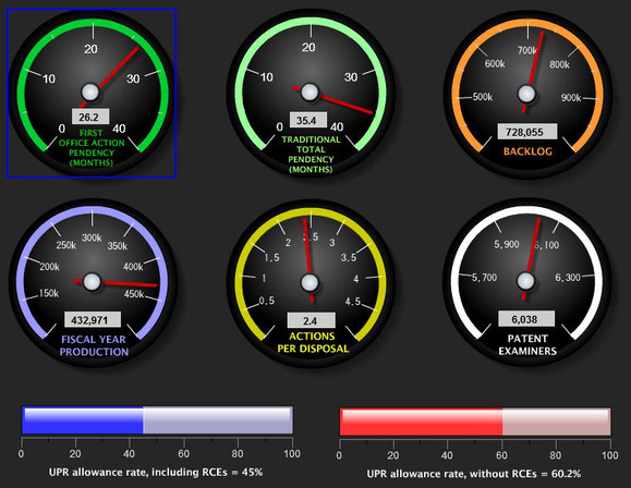
Fig. 1 A business dashboard visualising information using car gauges. Source: here.
What is a car dashboard? It is a set of gauges that are supposed to help the driver make decisions. In other words, it helps manage the car. It provides a number of useful pieces of information such as about the speed, fuel level, lights, etc. The important question is, what and how much information should be provided? Is the fuel level gauge necessary or can it be removed completely? What can be the consequences of its absence? Does the driver know how to use it and what decisions should be made based on its indications?
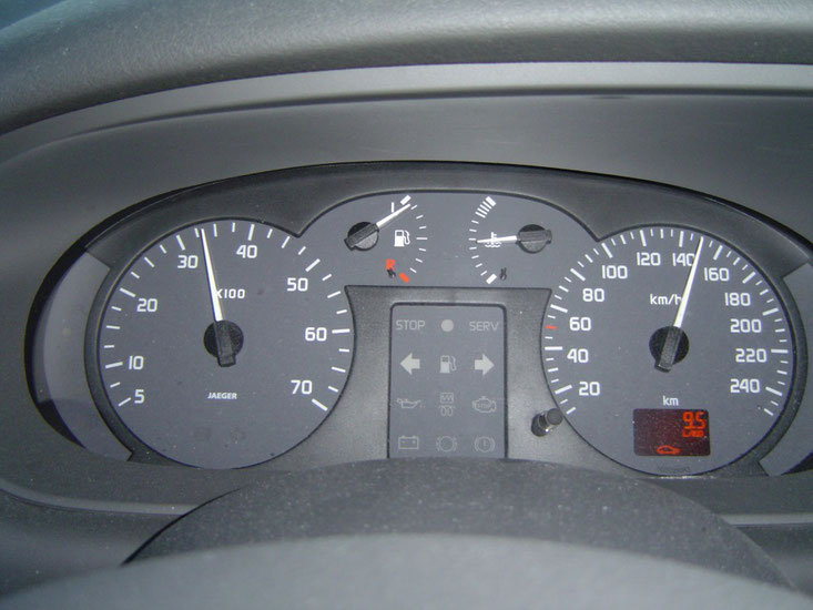
Fig. 2 Dashboard in a Renault Scenic including a fuel level gauge. Source: here
The same applies to business. The dashboard should provide the information necessary to make decisions. It should, therefore, be designed correctly. You need to select the number and type of presented pieces of information in the right way. The paramount rule of designing dashboards is to present only the necessary information. If you wish to visualise more information, you need to prioritise. The design of manager dashboards is based to a large extent on the presentation of KPIs ( Key Performance Indicators).
The next important question is: how should the information be presented? This all revolves around for what and how the information will be used. Let's go back to the car. How do you know when to shift gears? You can listen to the engine, you can use the tachometer, or stick to the shifting suggestions of the onboard computer. The way the information is communicated and received should be suitable to the manager that is the recipient.
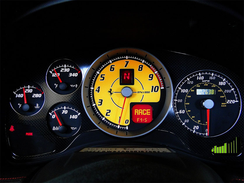
Fig. 3 The dashboard in a Ferrari 430 Scuderia. RPM information: the tachometer, LEDs on the wheel, and the current gear on the tachometer display. Source: here
A racing driver needs different information to the one who rarely drives although their decisions are within the same domain. The thing is, the dashboard alone is not enough; there has to be a driver in front of it to read the information. Simplification can only go so far. Oversimplification results in rigidity in decision-making due to the lack of significant information. This is the case when a manager's competencies exceed the level of information provided. A good manager will surely still be better at making decisions than a poor one. Yet, if a good manager had more information, the results could be much better. In a nutshell, the selection of the information provided should depend on the competencies of the manager.

Fig. 4 The cockpit in an Airbus A380. The complexity of the information and its amount requires highly qualified ‘managers’. Source: www.en.wikipedia.org
The simplification of the provided information is not a bad idea. As a matter of fact, it is desirable particularly when a piece of information is replaced by a recommendation of action, for example, to shift gear. Not all areas work well with such adjustment of the information. Sometimes, the background of the recipient is as key as the design of the dashboard; one will not work without the other. Just think of the driver's seat and the cockpit of a passenger aeroplane. It goes without saying that for the ‘management’ of the aeroplane in mid-air to go well, the range of potential ‘managers’ has to be strictly limited.
The analogy between the car dashboard and the business dashboard works for the visualisation aspect as well. Manager dashboards often use similar forms of visualisation such as gauges, counters, or warning lights. The layout of the information is often similar as well. The reference to the appearance of the instrument board is not always valid.
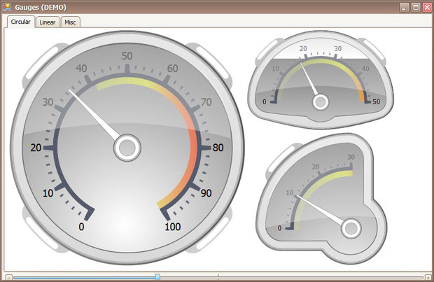
Fig. 5 Gauges on a computer screen imitating a car dashboard. Source: www.http://business-intelligence.blognotions.com[
At this stage, the question is: what manager dashboards are used in business reports? There are many definitions and they differ depending on the focal point of the author: IT, data analysis, visualisation, information sharing, etc. I will quote the definition of a recognised authority, Stephen Few in his book Information Dashboard Design. The Effective Visual Communication of Data defines the dashboard as
… a visual display of the most important information needed to achieve one or more objectives; consolidated and arranged on a single screen so the information can be monitored at a glance (Few 2006, 34).
This definition focuses on perceiving manager dashboards as a form of visualisation and presentation of information necessary to make decisions. Let's have a look at several key elements of such a visualisation.
First, information first. It is usually key performance indicators (KPIs) for a specific business area. It is not an easy task to define and calculate them to start with. As a result, the visualisation on the screen may require a substantial effort to introduce information from data. Apart from gauges, the dashboard can present other types of information such as a to-do list. They are not part of data analysis but may be useful in business management.
Second, information on a single screen. This can be achieved in two ways. By decreasing information content or increasing information density. The idea behind KPIs is that they are really key and that they there are only several of them, not several dozen. Information density can be improved by selecting the right form of visualisation. The single-screen rule doesn't have to exclude dashboards made up of multiple screens. Be careful not to tip the scales, though; the key to success is the selection of information, not a ‘barque’ interface with countless forms of visualisation, warning lights, etc.
The phrase ‘on a single screen’ used in the definition concerns a computer screen. In the case of the manager dashboard, the information is distributed primarily through computer screens. This calls for a different approach than when designing hard copy reports. On the one hand, it improves the possibilities, but on the other hand, it is a significant problem. While in the case of paper, we use predominantly the A4 or Letter sizes, the resolution of screens and their ratios vary greatly. Another decision to make is whether the dashboard will be accessed with a dedicated application or just a web browser. Additionally, as the technology surges forward, maybe the word ‘computer’ should be replaced with ‘electronic device’ because managers use smartphones and tablets increasingly more often.
Third, let's focus on the phrase that information should be available ‘at a glance’. A good dashboard is a dashboard that is well designed. It has to clearly represent phenomena that require attention and warn about problems. It may, but doesn't have to, explain the nature of the problem and recommend specific actions. The nature of the problem may be determined under a separate procedure. Recommended actions may be left to the manager to decide or may be described in detail. Whether a dashboard should provide recommendations or just information depends on the application. Dashboards for operational purposes differ from the ones used to determine strategies.
FROM INFORMATION TO DECISIONS
The dashboard cannot be designed independently of its intended use and the recipient. This statement leads to the dashboard typology. Dashboards can be divided using various criteria. I will now focus on the division by intended use. S. Few (Few 2006, 40) lists three types of dashboard purposes:
- strategic,
- analytical,
- operational.
This will be an attempt to describe them shortly and discuss their usefulness and functionality in slight opposition to Few.
The first type of dashboard is the ‘executive dashboard’ used for strategic management. Its purpose is to help monitor the condition of the whole organisation or selected large business areas. These dashboards focus on high-level measures and forecasts. Actual values are juxtaposed with reference values but in the form of an overview. They present the achieved values as good or poor and avoid any in-depth or complex gradation of the values. In this type of dashboard, simple visualisations work the best. The indices are more often than not long-term gauges, which makes immediate action unnecessary. The information does not have to be updated in real time. Usually, it is unnecessary to provide interactive elements leading to more in-depth analyses. The primary function of the strategic dashboard is to notify about a problem, not to account for it. This is all S. Few (Few 2006, 41) had to say about the characteristic features of this dashboard.
When designing these dashboards, it is important to realize what business responsibility the user has. It is usually difficult to obtain this information directly to the extent that would allow the designer to use adequate indices. In order to design a dashboard well, the user has to participate unless you are perfectly aware of their expectations. Strategic dashboards are often individualized for a specific user. When it comes to strategic dashboards, genuine cooperation with the prospective recipient usually requires significant knowledge, which increases the chance of them being taken seriously. The restrictive selection of information is important here as well. To sum up, the selection of information is the key in the case of strategic dashboards. Inadequate selection usually results in a less trust of the managers in the data or the impression that it is useless. Interactive features of a dashboard (such as drill-down, slice and dice) used to conceal the excess of information generally don't work in the designer's favour.
The identification of a problem doesn't have to entail an explanation of its nature. High-level managers may seek the help of their subordinates to gain insight into the reasons for the problem. It is to be expected, as in the management of a whole made up of so many elements that could go wrong, that the detailed diagnosis of the cause requires a greater effort. It may be impossible to construct a dashboard that explains the causes.
Strategic dashboards usually do not require precision down to ‘the decimal place’. What is usually important are general relations to reference values. ‘Traffic light’ system of red is bad, amber is almost-but-not-quite, and green is good is usually right for this type of dashboard. This is in line with the rule that actions should be possible ‘at a glance’. S. Few wrote: ‘Extremely simple display mechanisms work best for this type of dashboard’ (Few 2006, 41). This is not necessarily the case. The key is to present forms of visualisations adequate for specific measures.
For example, the presentation of only average values without any measure of dispersion may lead to misinformation. There is nothing wrong in presenting such information together, for example, in the form of box charts or error bars. The precondition is that the recipient is prepared for it. An explanation of the meaning of a specific form of visualisation upon the first use gives you the option to use it regularly. This increases the array of means of communication. It can be useful later for visualisation of different data. Back to transport metaphors; the spatial position of the aeroplane is determined using a very important instrument, the altitude indicator. Instead of trying to convey the information about the pitch and bank in a simpler way, it is better to teach the recipient how to use the altitude indicator. This was one way to look at it. ‘Simple mechanisms’ is a relative term. Its meaning depends on the level of comprehension of the recipient.
The last dimension of the strategic dashboard that has to be mentioned is the time interval of the data. The data can be presented for a year, often a quarter or month, or, more rarely, for a week. For measures presented as YTD (Year-To-Date), the ‘date’ doesn't have to mean today. Incremental presentation of the value ending on the last day of the previous month is usually enough. In practice, it is not always possible to ensure really up-to-date data because it may require additional verification. The correctness of the information is usually more important because it may be costly to reverse a decision once it is made.
Now, to the second type of dashboard; it is the analytical dashboard whose purpose is to support multi-faceted data analysis. Analytical dashboards should provide a broader context for the information, a more in-depth comparison of information in various dimensions. Just like strategic dashboards, they present data for quarters, months, etc., and are not updated in real time. They employ more complex forms of visualisation that help investigate relations between variables. It is advisable to include interactive elements to drill down to more detailed data. This is the abridged S. Few's specifications of this type of dashboard (Few 2006, 41).
I find this type of dashboard the most controversial. In my view, its usefulness is limited. I can't see why a good analyst would need such a dashboard. The key for them would be access to data, preferably well-organised data. Access to data gives you an extremely broad, not just broader informational context. Some repetitive elements of analyses, should, of course, be automated and arranged in predefined dashboards. Instead of a predefined dashboard, I would, however, appreciate a tool that would facilitate flexible work with data, reporting, and distribution of results. Dashboards can replace access to data only to a limited extent. Furthermore, flexibility in the form of drill-down and slice and dice mechanisms may lead to data proliferation. If an index can be analysed in several dimensions, the Cartesian product of the dimension category may turn out to exceed the size of the initial set necessary to build an OLAP cube, for example. Then there is the question who should design such dashboards? A ‘technical’ operative based on the needs of an ‘analytical’ operative? Will they communicate effectively and will the result be flexible enough? What if the problem eludes regular framework of thinking? Will the analyst have to use raw data or wait for somebody to develop a new dashboard? Now, when talking about these dashboards, ‘analyst’ may mean people of diverse competencies. This doesn't mean they should not work on their knowledge of statistical methods, data comprehension, data organisation in databases, etc. More than to analytical dashboards, I take to the approach where data analysis and visualisation tools are simplified and simultaneously analysts' competencies are improved. I find this approach more effective because there is a fundamental difference between users of strategic and analytical dashboards. Recipients of strategic dashboards may officially request further information. Recipients of analytical dashboards may only ask for help’.
The last group of dashboards are operational dashboards. Their purpose differs from the two other types. Their primary task is to track online activities in a specific area, hence, the information in these dashboards has to be updated in real time. This type of monitoring requires the operator's attention. It means the forms of visualisation have to be simple. The nature of the data necessitates quick reaction of the operator. Clear alerts with the information of the value of deviation are essential. The monitored area is usually very narrow and specific. Operational dashboards often require a high level of detail and ‘technical’ indices. This is how S. Few (Few 2006, 42) described them.
Operational dashboards are popular tools for quality control in production processes and so they can profit from the experience in this domain. The manager who uses this type of dashboard needs specific field knowledge or has to be well trained. It is essential because they need to take quick actions important for real-time management of the process. For quality control, this may include rejection of an item or a whole lot, machine stoppage, or mechanical adjustment. Therefore, for these dashboards, it is advisable to display recommended actions. If the dashboard fails to provide such recommendations, highly formalized procedures for necessary actions should be in place. They may take the form of a kind of checklist. For this type of dashboard, all the key information should be conveyed on a single screen as in the case of a car dashboard. The operator should be trained well to know what actions need to be taken and when; such as when the low fuel warning lights up. They should also know that a different reaction is appropriate when the low tyre pressure light is on. Sadly, these dashboards cannot always be limited to a single screen. It may be necessary to include navigation between dashboards (for example drill-down, hyperlinks) or dynamic dashboards where different information types can be displayed depending on the circumstances. Such dashboards can be compared to a passenger aeroplane cockpit where the number of parameters to control is much greater than in a car. Two elements are essential in such a case: appropriate design of the dashboard and high, virtually ‘technical’ competencies of the operator. It is also advisable to include procedures for recommended actions in operational dashboards. If not everything can be predicted, operator's competencies are the key. The car and aeroplane cockpits are different as regards the level of complexity but what they have in common is that many actions need to be taken in real time or relatively soon after the alert.
FROM A CHART AND TABLE TO A GOOD DASHBOARD
This section can either be very short or it can drag on. I chose the first path otherwise, we would need a book or a series of posts on manager dashboard design. This section will serve as homework for the reader. It will present two manager dashboards for airlines. One of them was appreciated in the Business Intelligence Network Data Visualization Competition 2006.
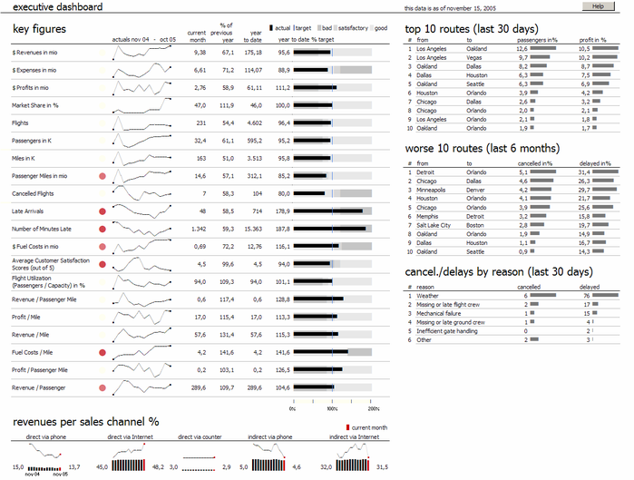
Fig. 6 Award-winning manager dashboard. Source: www.dashboardinsight.com
Have a look at the two dashboards. Compare them and find their advantages and disadvantages. You may be biased by the information that one of them won an award but it doesn't have to mean that this one is perfect while the other one is poor. My intention was to induce you to reflect upon the nature of this form of reporting. The dashboard is not just a bunch of charts and tables mixed on the screen, but a result of a number of decisions made at the design stage. Just as there is no relation between the quality of a report and its size, there is no relation between the number of screens and the quality of a dashboard. Technological possibilities of interacting with data and navigating between dashboards doesn't necessarily translate into the final usefulness of the dashboard.
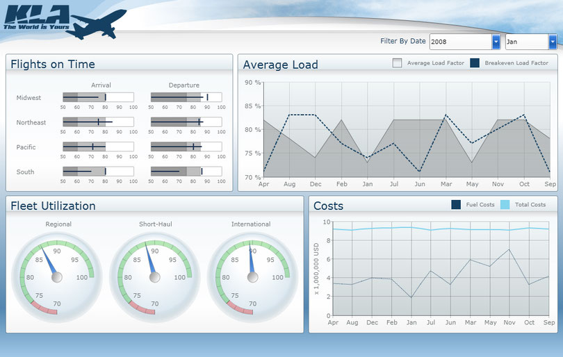
Fig. 7 Example of a manager dashboard with information about an airline. Source: www.dashboardinsight.com
When looking at dashboards keep in mind that their primary task is to communicate important information necessary to make decisions. It is not an easy challenge to design such a dashboard. It involves the calculation and selection of appropriate indices, setting thresholds and reference values, selection of visualisations, combining them, and choosing the update rate. Dashboard design also includes decisions regarding the types of devices and technologies the dashboard will be accessed with.
How to start designing business dashboards? It is a good idea to use software that has predefined types and templates of visualisations typically used in dashboards. The information to be presented and the recipient have to be well thought-through. Take into account the distribution method and test prototypes with prospective recipients. This is of course just the beginning of the path.
Finally, let's look back at the maxim supposedly by Pushkin ‘reading is the best way to learn’. Those who are interested in designing good dashboards might find the reading list below useful. It can be a good beginning of the journey into the world of business dashboards.
READING LIST:
Baroudi, Rachad. KPI Mega Library: 17,000 Key Performance Indicators. Scotts Valley: CreateSpace Independent Publishing Platform, 2010.Bertin, Jacques.
Semiology of Graphics: Diagrams, Networks, Maps. Redlands: Esri Press, 2010.
Eckerson, Wayne W. Performance Dashboards: Measuring, Monitoring, and Managing Your Business. Hoboken: Wiley, 2010.#
Few, Stephen. Information Dashboard Design. The Effective Visual Communication of Data. Sebastopol: O'Reilly, 2006.
Show Me the Numbers: Designing Tables and Graphs to Enlighten. Oakland: Analytics Press, 2004.
Harris, Robert L. Information Graphics: A Comprehensive Illustrated Reference. New York: Oxford University Press, 1999.
Parmenter, David. Key Performance Indicators (KPI): Developing, Implementing, and Using Winning KPIs. Hoboken: Wiley, 2010.
Tufte, Edward R. The Visual Display of Quantitative Information. Cheshire: Graphics Pr, 2001.
Ware, Colin. Information Visualization: Perception for Design. San Francisco: Morgan Kaufmann, 2004.
Contact us to find out more about these and all other great features of PS IMAGO PRO!

Kommentar schreiben