
DATA
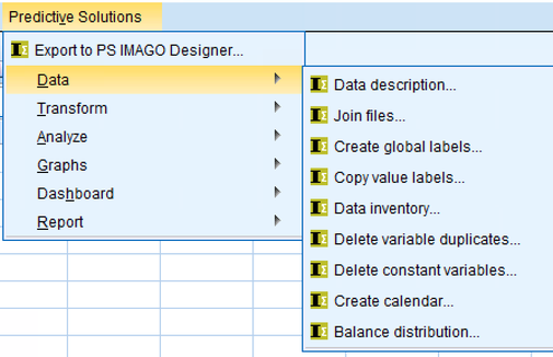
Data description
Create a data dictionary for selected variables in IBM SPSS Statistics Syntax Editor or IBM SPSS Statistics Viewer report windowsThe PS VARIABLES DICTIONARY procedure describes selected variables by the relevant syntax or creates a list of all the properties of the selected variables in the report window.
Application: Preparing data for analysis, such as retrieving text data and describing it with a set of commands prepared using a different data set.
Join files
Merge multiple SAV files (using the "add cases" method).
The procedure merges all SAV files located in the selected directory. It also allows to determine a file containing the variable dictionary. New cases are added to the sample file based on the variable names to obtain the correct order of the data.
Create global labels
Create global labels for selected variables.
Application: helpful when creating result objects. It facilitates the parameterization of descriptions of diagrams, tables and other result objects with labels of variables stored in the form of macros.
Copy value labels
Assign a selected variable based on values or labels of a source variable label.
Application: Preparation of data for analysis. Copy value labels from one variable to another.
This procedure can be used, for example, after a variable has been recoded into another variable or when the descriptions for values (codes) are located in a separate variable.
Data inventory
Use this dialog box and procedure to find IBM SPSS Statistics application data files in a selected folder and its subfolders, optionally using regular expressions to define the names of the files you are searching.
You can use the PS FILES INFO procedure to obtain a comprehensive description of IBM SPSS Statistics application data files in SAV format.
Delete variable duplicates
Use this dialog box and this procedure to find or delete variables that are duplicates of other variables. A variable duplicate is a variable that takes the same values for each observation as the variable it is compared to. Missing system and user-defined values are interpreted as one and the same value and are considered as one value when checking whether a particular variable is a duplicate.
This procedure is useful for preparing data for analysis. It limits the size of the data file by deleting variables that have no value for analysis. Variables with different names that are duplicates of other variables in terms of the assumed values do not contribute to the analysis.
Delete constant variables
Use this dialog box and this procedure to find or delete variables with constant values in the data file. If at least one observation takes a different value than the others, the variable is not considered a constant. Missing system and user-defined values are interpreted as one value and are taken into account when checking whether a particular variable is a constant.
This procedure is useful for preparing data for analysis. It limits the size of the data set by deleting variables that have no value for analysis. Variables with constant values do not contribute to the analysis.
Create calendar
Use this dialog box and this procedure to create a new dataset and create new cases in it in the next step. The procedure adds the following current date to each case, beginning with the start date and ending with the end date, both of which were previously defined. The number of cases corresponds to the number of days between the previously defined dates.
The procedure is useful in the data preparation phase. One can often find missing values, breaks or gaps in processes that have been observed over a long period of time. A correct analysis and visualization can therefore be difficult.
The PS-CALENDAR method creates a data set with continuous dating series and thus fills gaps in the time series. Then the new data from the other file can be added after appropriate transformation (e.g. aggregation).
TRANSFORM
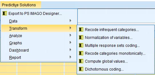
Recode infrequent categories
Use this dialog box and this procedure to recode a variable into a new variable with a smaller number of categories by merging rare categories. The categories of the new variable can be merged into the category "Other" depending on the number or percentage of observations in a particular category.
This procedure is useful for preparing data for analysis. It can be used to calculate simplified variables for the purpose of analysis and visualisation of the results.
Normalization of variables
Use this dialog box and this procedure to scale selected ordinal or quantitative variables with standardization or min-max normalization. Values of variables that are scaled are transformed so that the resulting variable has a user-defined mean and standard deviation (standardization) or a minimum and maximum (min-max normalization).
This procedure is useful for preparing data for analysis. It makes it easier to reduce multiple variables to a common range, which is an important step before using data for modeling with algorithms that respond to the predicted unit of measure of the variable.
Multiple response sets coding
Use this dialog box and procedure to transform a set of variables from multiple answers encoded as categories to a set of dichotomies, or vice versa.
This procedure is useful for preparing data for analysis. It can be used to change the coding of variables with multiple choice questions. As a result of the procedure, a new set of variables is created in the Data Editor window. The original set of variables remains unchanged.
Recode categories monotonically
Use this dialog box and this procedure to recode a variable into a new variable whose categories are ordered by frequency. The categories of the new variable can be ordered: in ascending order: from the category with the lowest number of observations at the beginning; or in descending order: from the category with the largest number of observations to the smallest.
This procedure is useful for preparing the data for analysis. It can be used to arrange categories into variables for the purpose of analysis and visualization of results. For example, if you want to sort categories of a nominal variable by frequency in tables and graphs, you can use the monotonous recoding procedure.
Compute global values
Use this dialog box and procedure to calculate summary statistics for selected variables, such as mean, median, sum, minimum, maximum, standard deviation, number of cases, unweighted number of cases, first value, last value. By selecting additional options, the summary statistics are stored as new variables in the data or in the dictionary that describes the data file as user attributes.
This procedure is useful for preparing the data for analysis. It can be used to calculate new variables using existing global values.
Dichotomous coding
Use this dialog box and procedure to create new dichotomous variables based on the value of any variable in the IBM SPSS Statistics Data Editor window.
ANALYZE
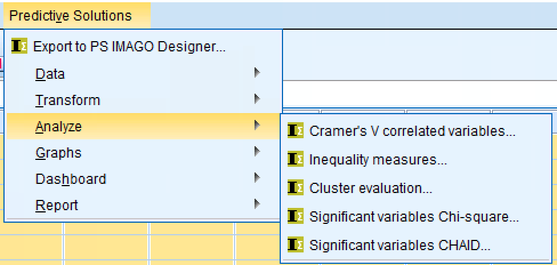
Cramer's V correlated variables
Use this dialog box and procedure to check and report the strength of correlation for a set of independent variables crossed with a dependent variable. The procedure produces a table and graph showing the value of the Cramer V Correlation for independent variables that have measured a nominal and ordinal value with respect to a selected dependent variable.
This procedure is useful for data analysis. It can be used to quickly check the correlation of a set of independent variables with a selected dependent variable.
Inequality measures
Use this dialog box and procedure to calculate and report selected measures of income inequality.
This procedure can be used to compare multiple quantitative variables that take non-negative values, or to compare the values of one such variable divided into categories determined by a qualitative division variable.
Cluster evaluation
Use this dialog box and this procedure to rate groups.
This procedure can be used to assess the quality of the observation group. The group evaluation procedure can generate the following result objects: Total silhouette value, Descriptive statistics for the silhouette, Silhouette value distribution by group, Group center of gravity distance and Observation to group center of gravity distance. In addition, the method can be used to generate variables with the silhouette value for each observation, the distance of the observations from the centers of the individual groups and the identifier of the nearest cluster for further analysis and store them in a data set.
Significant variables Chi-square
Use this dialog box and procedure to check and report the significance level for a set of independent variables crossed with a dependent variable. The procedure produces a table of Chi-square independence test significance levels for independent variables measured at the nominal and ordinal levels with respect to a selected dependent variable.
This procedure is useful for data analysis. It can be used to quickly check the significance levels of a set of independent variables in relation to a selected dependent variable. It facilitates the quick selection of independent variables for crosstabs. Further analysis of the variables selected by the Chi-square procedure allows a better understanding of their relationships.
Significant variables CHAID
Use this dialog box and procedure to check and report the significance level for a set of independent variables crossed with a dependent variable.
This procedure is useful for data analysis. It can be used to quickly check the significance levels of a set of independent variables with a selected dependent variable. It can also be used to automatically recode the categories of independent variables.
GRAPHS
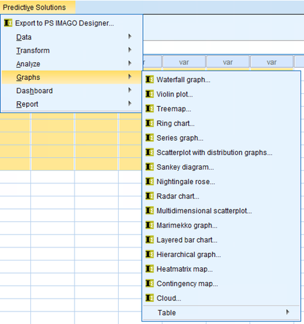
Waterfall graph

Use this dialog box and procedure to check and report the significance level for a set of independent variables crossed with a dependent variable.
This procedure is useful for data analysis. It can be used to quickly check the significance levels of a set of independent variables with a selected dependent variable. It can also be used to automatically recode the categories of independent variables.
Violin plot
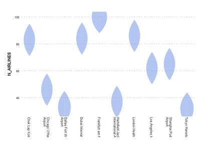
Use this dialog box and this procedure to create a violin diagram in the Report Editor window. The plot is used to visualize the distribution of quantitative data and probability density.
The plot can show markers of the median or quartiles.
The violin plot is very useful for comparing the variable distribution.
Treemap
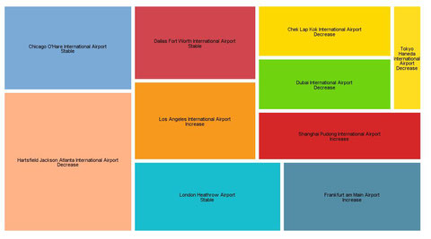
Use this dialog box and this procedure to create a tree map in the Report Editor window. It is a mosaic graphic whose interface is divided into segments according to the group statistics. The surface area of each segment is proportional to its share of the total size. If an optional quantitative variable value is introduced, the surface area of a segment can be changed using the variable total percentage. The segments can be colored with an optional target variable.
This graph type has functions for describing leaf nodes using the classification tree technique.
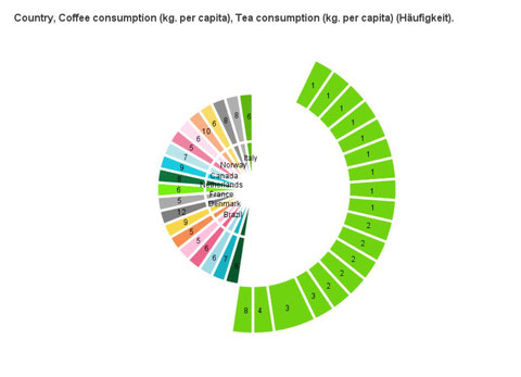
Ring chart

Use this dialog box and procedure to create a stacked pie chart in the IBM SPSS Statistics Viewer report window.
This chart is an advanced version of the simple pie chart, which displays the number of qualitatively variable categories as a percentage in the form of ring segments. Comparison also divides the chart into rings representing categories of another qualitative variable.
The ring chart is best suited for visualizing data as part of a whole. A stacked ring chart, on the other hand, introduces an additional dimension to the comparison.
Series graph
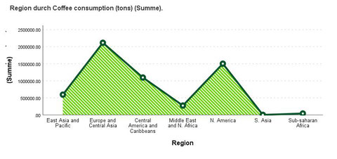
Use this dialog box and this procedure to create a row plot in the Report Editor window and add additional dimensions to the plot, with an additional quantitative variable on the y-axis, a color variable measured nominally or ordinally, or a variable with information about whether an event occurred.
The series representation is most often used to represent time changes.
Scatterplot with distribution graphs
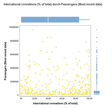
Use this dialog box and procedure to create a scatter (dispersion) graph for two numeric variables with a distribution graph for both variables in the IBM SPSS Statistics Viewer report window.
By using this procedure, a graph displays information about the relative positions of the values of the two numeric variables in two-dimensional space (X, Y) and information about the distribution of the variables. Scatterplot is the primary graph.
It is useful for creating potential relationships between quantitative variables.
Sankey diagram

Use this dialog box and this procedure to create a Sankey diagram in the Report Editor window.
The diagram is used to illustrate the relationships between specific categories of variables. It consists of two groups of elements - nodes (bars), which represent categories, and links (flows), which illustrate the relationships between categories.
The size of the nodes and links corresponds to the number or sum of a specified quantitative variable. Connections can be colored using the optional Color variable.
Nightingale rose
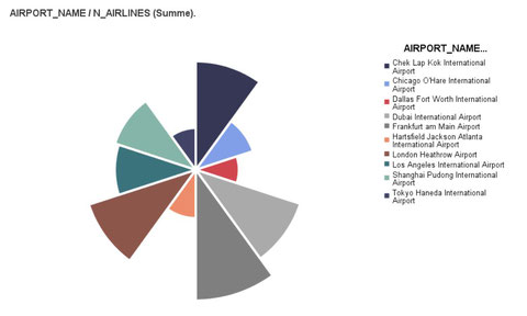
Use this dialog box and procedure to create a Nightingale Rose chart in the IBM SPSS Statistics Viewer report window.
This chart is a variation of a side-by-side bar chart displayed in a polar coordinate system. A chart similar to the pie chart is created. Its circle segments have the same angles, but different radii.
Due to the fact that each segment has the same angle and variable values are represented by the length of the radii, this chart is a suggestive visualization that is especially useful for events that occur over time (such as births in individual months).
Radar chart
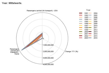
Use this dialog box and procedure to create a radar chart in the IBM SPSS Statistics Viewer report window.
This chart can be used to display values of summaries of multiple quantitative variables by assigning a variable to each axis in a polar coordinate system and drawing a line through points corresponding to the values of individual summaries.
Multidimensional scatterplot
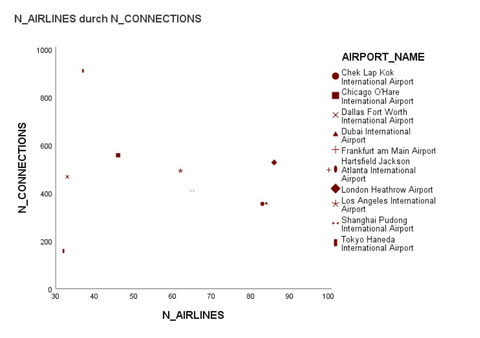
Use this dialog box and procedure to create a simple scatter plot (scatter graph) for two numeric variables and to include additional dimensions in the graph, represented by the size, shape and color of the symbols used in the scatter graph in the IBM SPSS Statistics Viewer report window.
The scatter graph is the primary graph. It is useful for creating potential relationships between quantitative variables. For example, it is a useful tool for creating an unobvious structure of factors or dimensions in a discriminant analysis.
Marrimeko graph

Use this dialog box and procedure to create a Marimekko chart in the IBM SPSS Statistics Viewer report window.
This type of chart is used to compare proportions (quantities or sums) in nested qualitative data. For example, it shows the contribution to sales of product lines in different regions of the world for a manufacturing company.
The Marimekko chart is perfectly suited for the graphical representation of cross tabulations.
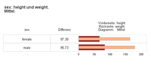
Layered bar chart

Use this dialog box and procedure to create a multi-layer bar chart in the IBM SPSS Statistics Viewer report window.
This type of chart is perfect for comparing two quantitative variables that represent the same indicator in two periods within a category of a qualitative variable; for example, comparing last year's sales and current sales in each month of the first two quarters.
Hierarchical graph
Use this dialog box and procedure to create a hierarchical chart in the Report Editor window. This type of chart is perfect for displaying hierarchical data that can be easily viewed at different levels of aggregation (for example, data for schools and classes).
Components of the chart can be colored with an optional target variable.
This type of chart can be used, for example, to represent the structure of a decision tree and the values expected from it.
Heat matrix map
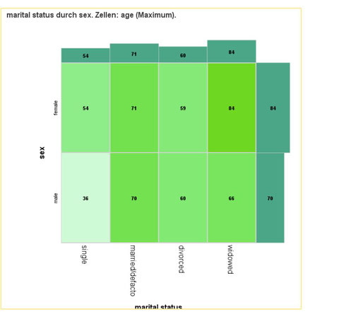
Use this dialog box and this procedure to present summaries of a quantitative variable within groups in isolation based on categories of two qualitative variables with a heatmap with an overview map at the border. You can also add cell and bar labels to provide the map with cross-table characteristics.
This procedure creates an overview map that presents summaries for a qualitative variable within groups that result from an overlap of categories of two qualitative variables. It combines the advantages of a heat map and a cross-table. Selected statistics for the quantitative variable are displayed in cells of the overview map by color intensity and labels (optional). In addition, there are bar charts that show the boundary value of the selected statistics at the boundaries of the heatmap.
Contingency map
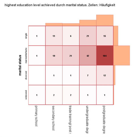
Use this dialog box and this procedure to display two qualitative variables with a heat map with bar graphs of the limit number. In addition, you can add cell and bar labels to provide the map with contingency table functions.
The procedure creates a contingency map that visualizes two qualitative variables with the best features of heatmap and contingency map. Selected statistics are represented in the cells of the contingency map by color intensity and labels (optional). In addition, there are bar charts that show the marginal distribution of the variables at the borders of the heatmap.
Cloud
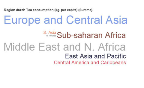
Use this dialog box and this procedure to present data in the form of a word cloud or bubble cloud. The more often a particular numeric or textual variable category occurs, the larger the word or circle.
Alternatively, the procedure allows you to distinguish between word and circle sizes based on the sum of another quantitative variable. It is also possible to use an additional color variable whose dominant, mean, or sum controls the color of the item.
GRAPHS - Table

Table - Series
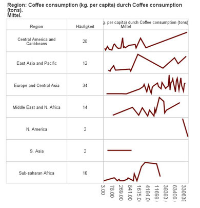
Use this dialog box and this procedure to display time series graphs in a table. Decide which statistics to display in a line, a line with points, a bar, or a stratification chart. Additionally, select any number of available statistics to be displayed in table columns and decide whether table cells containing statistics should be displayed in color.
This procedure is useful if you want to display a summary of a quantification titration variable in time with division into groups. This function offers the advantages of both charts and tabular summaries.
Table - Layered
Use this dialog box and this procedure to display multi-level bar charts in a table. Decide which statistics to display in the bar chart. Additionally, select any number of available statistics to be displayed in table columns and decide whether table cells containing statistics should be colored.
This procedure is useful for comparing summaries of two quantitative variables divided into groups with additional summaries to be displayed in table cells. This function offers the advantages of both charts and tabular summaries.
Table - Histogram

Use this dialog box and this procedure to display histograms in a table. Decide whether the displayed histogram should be divided by color variables. Additionally, select any number of available statistics to be displayed in table columns and decide whether table cells containing statistics should be colored.
This procedure is useful if you need to display the distribution of a quantitative variable on a histogram with additional summaries. This function offers the advantages of both charts and tabular summaries.
Table - Error bars
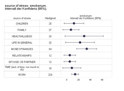
Use this dialog box and this procedure to visualize error bars in a table for the mean value of an analyzed variable in groups formed by values of another variable. Additionally, select any number of available statistics to be displayed in table columns and decide whether the median should also be displayed in the error bar graph.
This procedure is useful for displaying the distribution of quantitative variables in groups with additional summaries. This function offers the advantages of both charts and tabular summaries.
Table - Boxplot
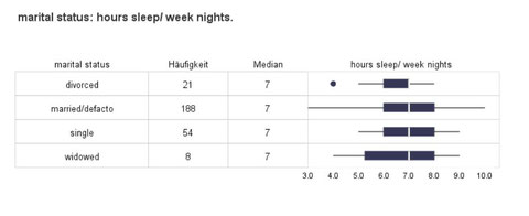
Use this dialog box and this procedure to visualize box plots in a table for one analyzed variable in groups created by values of another variable. In addition, select any number of available statistics to be displayed in table columns and decide whether the mean value should also be displayed in the boxplot.
This procedure is useful for displaying the distribution of quantitative variables in groups with additional summaries. This function offers the advantages of both charts and tabular summaries.
Table - Bars
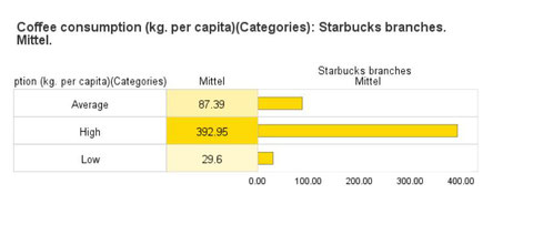
Use this dialog box and this procedure to display bar charts in a table. Decide which statistics to display in the bar chart. Additionally, select any number of available statistics to be displayed in table columns and decide whether table cells containing statistics should be colored.
This procedure is useful for displaying count or group count percentages or statistics for a quantitative variable that is divided into groups with additional summaries. This function offers the advantages of both charts and tabular summaries.
DASHBOARD

Dashboard - Dartboard

Use this dialog box and this procedure to visualize in a dashboard a comparison of an index in groups determined with categories of a qualitative variable.
The PS DASHBOARD DARTBOARD procedure displays the results in the form of a dartboard. Individual categories are represented by dots. The closer a category is to the centre of the dartboard, the higher the value of the coefficient.
Dashboard - Arrowes & Traffic Lights
Use this dialog box and this procedure to visualize in a dashboard a result of an index in groups determined with categories of a qualitative variable. The PS DASHBOARD ARROWS procedure displays a result in the form of arrows or traffic lights. In Arrows mode, an arrow is displayed for each category. Its angle of inclination (and colors, if used) depends on the value of the variable Values.
This type of visualization is particularly useful for showing a change in value between two points in time. In Lights mode, an object similar to a traffic light is displayed for each category. If the light on the left is lit, the value for the category is incorrect, the middle light means an average result and the right light means a good result.
DASHBOARD - Percentage of Target

Dashboard - Percentage of Target - Gauge
Use this dialog box and this procedure to display the degree of completion of a target group in groups in a dashboard. The PS DBSIMPLE GAUGE procedure compares the actual values of the completion of a task with the target values and displays the results in the form of a slider or pointer instrument.
Dashboard - Percentage of Target - Thermometers
Use this dialog box and this procedure to display the degree of completion of a target group in groups in a dashboard. The PS DBSIMPLE THERMOMETERS procedure compares actual task completion values with target values and displays the results in the form of a thermometer.
Dashboard - Percentage of Target - Bars
Use this dialog box and this procedure to display the completion status of a target group in groups in a simplified dashboard. The PS DBSIMPLE BULLET procedure compares the actual task completion values with the target values and displays the results as a bar chart.
Dashboard - Percentage of Target - Bricks
Use this dialog box and this procedure to display the completion status of a target group in groups in a simplified dashboard. The PS DBSIMPLE BRICKS procedure compares the actual values of the completion of a task with the target values and displays the results in the form of a brick diagram.
DASHBOARD - Percentage of Target Thresholds
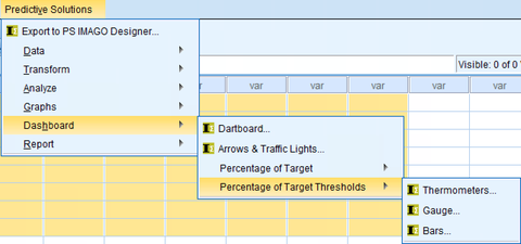
Dashboard - Percentage of Target Thresholds - Thermometers
Use this dialog box and this procedure to display the degree of completion of a target group in groups in a dashboard. The PS DASHBOARD-THERMOMOMETER procedure compares actual task completion values with target values and displays the results in the form of a thermometer.
Dashboard - Percentage of Target Thresholds - Gauge
Use this dialog box and this procedure to display the degree of completion of a target group in groups in a dashboard. The PS DASHBOARD GAUGE procedure compares the actual values of the completion of a task with the target values and displays the results in the form of a slider or pointer instrument.
Dashboard - Percentage of Target Thresholds - Bars
Use this dialog box and this procedure to display the degree of completion of a target group in groups in a dashboard. The PS DASHBOARD BULLET procedure compares the actual completion values of a task with the target values and displays the results in a table bar chart.
REPORT
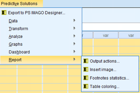
Output actions
Use this dialog box and this procedure to change the structure of the report in the IBM SPSS Statistics Viewer window
You can use the PS SELECT OUTPUT procedure to change the visibility (show/hide) of report elements or remove them completely (delete).
Insert image
Use this dialog box and this procedure to insert an image file into the Report Editor window.
Use the PS INSERT IMAGE procedure to insert a *.gif, *.jpg, or *.png file into your report.
Footnote statistics
Use this dialog box and procedure to modify frequency tables in the IBM SPSS Statistics Viewer report.
You can use the PS FOOTNOTES STATS procedure to change frequency tables by adding the statistical values calculated in the statistics table to their footnotes. Statistics tables are generated for the result of each frequency procedure.
Table coloring
Use this dialog box and procedure to change the appearance of the tables in the IBM SPSS Statistics Viewer report.
The PS COLOR TABLE procedure can be used to change the appearance of a single table or a group of selected tables.
Kontakt
2x4 Solutions GmbH
Eichenring 23a 84562 Mettenheim Deutschland
Telefon: +49 8631 3516525 Email: info@2x4.de
Contact
2x4 Solutions GmbH Eichenring 23a 84562 Mettenheim Germany
Phone: +49 8631 3516525 Email: info@2x4.de
Hinweis
Unser Angebot richtet sich ausschließlich an gewerbliche Kunden. Alle angegebenen Preise zzgl. ges USt. Für Firmenkunden aus der EU (nicht Deutschland) wird das umgekehrte Mehrwertsteuerverfahren angewendet, wenn uns eine gültige UST-ID vorliegt.
Notice
Our offer is for business users only. All shown prices are net values and VAT will be added. If we know the customers VAT ID, we will use reverse VAT for EU-companies outside Germany.
